
Before buying your first Kirsten Vaams garment, I thought you might be curious about what exactly stands behind the iconic logo. In fact, very few people know its meaning. The truth is I had been developing it for many months since the moment I realized that my mask business is not just a short-term thing. I had so many ideas popping into my head that I realised it will not be enough for two or five collections only.
In May 2020, I made the first collection of summer swimwear and it needed a visual statement and a brand. A few months before the outbreak of the pandemic, I tried hard to come up with a brand name, but nothing seemed good enough. My almost-dead Kirsten Vaams Instagram account seemed like a good temporary solution until I finally adopted it permanently.
While Kirsten is my middle name on the ID card, Vaams has no special meaning. It was just a few letters that resonated in my head back then when I was an 18-year old fashion student.

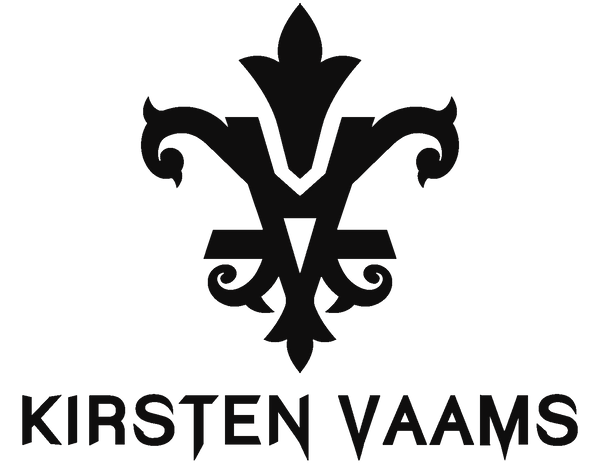
I wanted my logo to be unique and carry a message. I knew I wanted it to look curvy but with sharp edges, Gothic, because I love Gothic architecture.
The heraldic symbol of the lily (French Fleur de lys or Fleur de lis - "lily flower", ⚜) is the symbol of a lily flower seen from the front, where three petals are visible, two lateral ones and an upright central one. In heraldry, it represents (together with the symbols of the cross, eagle or eagle and lion) one of the frequent symbols and symbolizes purity, which is why it is associated with the Virgin Maria, to whom, according to legend, an angel, God's messenger, brought a golden lily. Furthermore, the heraldic lily was used for centuries as an architectonic decoration on many buildings in Prague and I loved the shape of it.
My first name, Maria, is associated with religion and the story of the beginning of our current civilization. Even though I have very little to do with religion, I see clear logic in the logo's link to my first name, and the shape of the heraldic lily seemed like a good proof for that.
If you look at the outline of the logo, you can see two letters crossing each other. In the vertical direction, you can see the letter K intersecting the letter V with a tip that is divided into three petals at the end. At a closer look, two arched arms emerge from the V, holding a ball at the end. This may resemble the uterus and ovaries, a symbol of femininity and fertility. When you look at the logo from a distance, the same arms with two points curled up can resemble horns, a symbol of masculinity.
I often come across opinions that this logo is significant, attracts attention and cannot be confused with any other brand. I am very satisfied with the result and I very much hope to see you wearing it, too.
With love
Maria Kirsten Kronová